In an age drowning in emails and digital noise, direct mail postcards are the bold, attention-grabbing rebels of marketing—delivering your message straight into eager hands. But catching the eye is just the start. To not only turn heads but drive action, whether it’s a call, a visit, or a purchase, your postcard needs more than flash; it needs strategy.
At Printing.com, we’ve tested thousands of postcard campaigns. The ones that perform best always have these elements. Whether you use one of our proven templates or partner with our design team for a custom solution, these five design elements are best practices to include in your design.
Learn more about a specific topic and jump right to it:
- A Headline that Hooks
- An Eye-Catching Layout
- Get Action With a Strong CTA
- Make Sure Your Brand Shines
- Track Your ROI
The Top 5 Must-Haves Are:
Mailbox Must-Have #1: A Headline that Hooks
Your headline is the most important text on your postcard. It’s the hook, the line that either grabs attention or gets ignored. In the split second someone glances at your postcard, the headline must convince them to keep reading. When done right, it can be the difference between a tossed card and one that drives action.
Here are some tips for an effective headline:
- Make it bold and scannable. Use large, prominent fonts and high contrast to stand out from across the room.
- Lead with a benefit. Tell people what’s in it for them, right away.
- Use strong, action-oriented words. Verbs like “Get,” “Save,” “Unlock,” “Discover,” and “Free” create momentum.
- Add urgency or scarcity. Limited-time phrases like “Today Only” or “Ends Friday” drive faster responses.
- Keep it short and punchy. Aim for 4–7 words that are easily read from arm’s length away.
- Skip full caps. Use title or sentence case for better readability and tone.
- Match your visuals. Your headline and image should reinforce each other.
Bonus tip: Try A/B testing headlines. For larger campaigns or segmented audiences, testing two headline versions is an easy way to learn which benefits or tone resonate most.
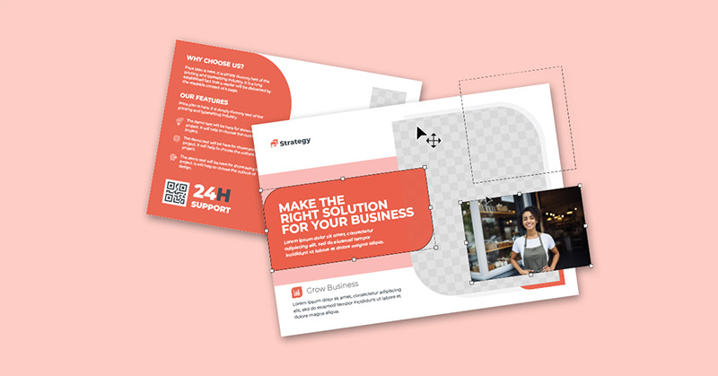
Mailbox Must-Have #2: A Clean, Eye-Catching Layout
Design isn’t just about making something look good—it’s about making it work. A clean, intentional layout ensures your message is not just seen but understood and acted on. In direct mail, where space is limited and attention spans are short, every design choice must serve a purpose.
A cluttered postcard overwhelms the reader, confuses your message, and reduces the likelihood of a response. A clean, eye-catching layout, on the other hand, guides the recipient’s eye naturally from headline to your call-to-action, without friction or distraction.
Consider the following tips:
- Use negative space intentionally. Generous spacing between elements allows each section to have its moment.
- Structure content by importance. Create a clear information hierarchy so the recipient can instantly grasp what matters. Use font size, weight, and placement to distinguish each tier of importance.
- Headline – The first thing they see. Make it bold and benefit-driven.
- Subhead – Supports or expands on the headline.
- Body Copy – Provides details, benefits, and context.
- Call-to-Action (CTA) – Tells them exactly what to do next.
- Use one strong image. A single, relevant image can communicate more than a paragraph of copy. If you’re unsure what to include, a product photo, a smiling customer, or a clean logo-backed visual often performs best.
- Follow eye movement patterns. Readers’ eyes naturally follow predictable scanning patterns.
- Z-pattern layout (best for simpler designs): Eyes move left to right, diagonally down, then left to right again.
- F-pattern layout (great for info-heavy layouts): Readers scan across the top, then down the left side with occasional horizontal movements.
- Balance visual and text elements. Aim for a roughly 60/40 split—60% visuals, 40% text.
Bonus tip: Don’t waste the back of the postcard. Use it strategically to reinforce your message.
Mailbox Must-Have #3: Turn Attention into Action With a Strong CTA
Every direct mail piece should have one clear next step. Tell the reader exactly what to do-and make it easy for them to do it. A strong call-to-action (CTA) is what turns attention into action. Without it, your postcard might create awareness, but it likely won’t generate results.
Your CTA should leave no room for confusion. Whether you want someone to book an appointment, visit your store, use a promo code, or call now, spell it out clearly and confidently. Don’t bury it in fine print or clutter it with competing messages.
When creating a CTA, keep these tips in mind:
- Make it bold and benefit-focused. Let your audience know what they’ll get. Is it a discount, a freebie, expert advice, or exclusive access? Make sure you clearly tell your audience what it’s in for them.
- Repeat it on both sides of your postcard. No matter how they flip it, the reader should always see what to do next.
- Create urgency. Deadlines and scarcity drive faster decisions. Try language like “Offer ends Friday” or “Only 25 spots available.”
- Use action verbs. Phrases like “Claim,” “Get,” “Visit,” “Show,” and “Book” feel active, immediate, and compelling.
- “Bring this card for a free dessert”
- “Use code LOYAL25 by Friday to save”
Bonus tip: Make your CTA visually stand out with color blocks, bold buttons, arrows, or icons to draw the eye directly to the action.
Mailbox Must-Have #4: Make Your Brand Shine with Smart Color & Font Choices
Your branding should shine, but never at the cost of legibility or message clarity. Fonts and colors aren’t just about aesthetics, they’re tools for guiding attention, building trust, and reinforcing your identity. When used thoughtfully, they can dramatically increase how well your message is read and remembered.
Follow these guidelines for effective branding on direct mail:
- Use your brand colors strategically. Brand consistency matters, but readability matters more. Use your core colors to create recognition, but keep body text high-contrast to ensure it’s easy to read at a glance.
- Apply bright or bold colors with purpose. Reserve vivid hues for elements you want to highlight, like headlines, limited-time offers, or your call-to-action button. Overusing bright colors can be distracting; underusing them can make key points blend in.
- Stick to clean, legible fonts. Decorative or script fonts should be used sparingly, and never be smaller than 12pt size. Sans-serif or simple serif fonts are easy to read and keep your messaging crisp and accessible, especially when scanned quickly.
- Feature your logo with intention. Your logo shouldn’t be an afterthought. Place it where it’s clearly visible—ideally on both the front and back of your postcard. This helps reinforce brand recognition without requiring extra reading.
Bonus tip: Design for visual consistency across campaigns and digital channels. Your direct mail shouldn’t feel like a one-off. When your colors, fonts, and logo placement remain consistent across postcards, flyers, emails, social media posts, and your website, it strengthens trust and builds a cohesive brand experience.
Mailbox Must-Have #5: From Postcard to Profit—Track Every Step
To measure success, you need to track it. Without a way to monitor responses, you’re left guessing what worked and what didn’t. Every direct mail piece should include a built-in mechanism to evaluate performance and tie results back to your campaign goals.
Some tracking options we recommend:
- Unique promo codes (e.g., LOYAL25): Assign specific codes to each campaign or audience segment so you can easily track redemptions.
- QR codes that lead to a landing page: These make it easy for recipients to take action with their phones and let you track visits, clicks, and conversions in real time.
- Personalized URLs (PURLs): Create custom URLs for each recipient or audience group to monitor traffic, personalize content, and track engagement with precision.
- Data-driven personalization: If you have purchase history or customer profiles, use that data to tailor the offer or message. This brings personal relevance to your campaign, and drives higher response rates.
Remember, tracking isn’t just about counting redemptions, it’s how you calculate the ROI of your marketing efforts, justify your spend, and improve results over time.
Bonus tip: Always set a baseline. Before launching your postcard campaign, record key metrics like average orders, web traffic, or sign-ups. This gives you a clear benchmark to measure impact and identify what to improve next.
Purposeful Design, Delivered
Design isn’t just decoration—it’s direction. Each element on your postcard should serve a single goal: to move the reader from interest to action. Whether you’re promoting a seasonal offer, driving foot traffic, or reactivating lapsed customers, a well-designed postcard can deliver serious ROI.
Want to take the guesswork out of postcard design? Browse our ready-made templates or talk to our design experts to create something custom and conversion-ready.
Get noticed. Get results.